Thursday, June 2, 2011

Workboxes Update

Last August I wrote about the workbox system I was implementing, and I promised to write a follow-up post in January or so. Well, June is more than a little late, but here is the follow-up on our workbox system.

The reason for this follow-up post is simple; many people blog about their wonderful workbox system they are just starting to use, but you don't hear much about what people have been doing for the long term. I, myself, have spent hours putting together a system that didn't last two weeks before, so I think it's important to let people know what has worked for us in the long term.

I am happy to say that we are still using workboxes. 
We have changed things from how we started, however. The biggest change is my two oldest kids. My 8th grader didn't start this school year with workboxes of any sort, but rather I was just giving him an assignment checklist. My 6th grader was using a workfolder system (see the August post I linked to in the first paragraph above). Neither of these held up to the test of time, mostly because they required regular updating from me. The workfolder system especially was an epic fail, as it took 10+ minutes daily of my time in order for it to work. 10 minutes isn't much, I suppose, but they were 10 unnecessary minutes and as such they all too often were spent elsewhere.

Even the way the little kids use their workboxes has changed slightly. The whole "take off the numbered square and put it on this grid" thing is gone. First, neither the kids nor I needed that movement of numbers to feel like the work was done. Completing a bin and putting it back is more than enough visually to get the idea across. Second, I have always allowed my kids at least some choice in the order they do their subjects, but me setting up the numbering took all choice away from them. 

Anyway, here is the description of how workboxes work in our homeschool now. We've been doing it this way for months (more months than we did it the other way) and I don't see it changing except I'm thinking of putting their colors on the ends so I can see more easily at a glance whose bin is whose.

Each kid has one bin per subject, more or less. My 8th grader has one bin per hour, as I require an hour from him a day for most subjects, but Spanish and Grammar only take up an hour together total. At the beginning of the school day everyone moves their bins away from their spot under the bookshelves and as they go through their school work they put the bins back one at a time. When they have gone through all their bins they are done for the day. They get to choose what order they want to do their work (I do override their choice as needed, but it isn't often) and that diminishing stack of bins is a great motivator. Many of the subjects don't require set up at all, as they are just "do the next thing" subjects like handwriting, math, and spelling. For history and science for the older kids I either give them a print out check list with lessons that will last them months at a time, or I refer them to the Sonlight Instructor's Guide to look up the assignment on their own. For the younger kids I put some IG pages in the bin with the books for me to use. The only bin, out of all five kids, that requires daily set up is the bin that holds my K'er's page from All About Reading Level Pre-1's Letters and Sounds Activity Book as it needs different craft supplies daily (I promise to do a review of AAR soon, it's WONDERFUL). Well, I've trained my guy that setting up for the next day is part of finishing up for today, so this bin is ready for the next day by the time he puts it away. Plus, that makes him excited for the next day too.
Anyway, that's our system in a nutshell. If you have any questions, ask and I'll give more detail.

Thursday, May 19, 2011

PSE Drop Shadows

This is a tutorial for adding shadows to items in Photoshop Elements; I'll be using digital papers but the steps will be the same regardless of what you want to add a shadow to. The screen shots are from PSE version 8, but the concepts apply to all versions. As always, click on any screen shot to see it full sized.

 First we just set up what we want a shadow on. I am using a couple digital papers from Daisy Country Value Collection created by Teresa Loman of Digital Scrapbook Place. I resized and rotated the yellow paper using the Free Transform tool.

Make sure the layer you want to apply a shadow on is selected (darkened) in the Layers bin on the right.


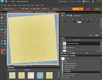
Now open the Effects bin on the right by double clicking on the word "Effects". Then select "Layer Styles" option; the icon is within the smaller red circle. Once that is selected, go to the drop down menu and select "Drop Shadows".


The "Low" option is most similar to what we want our shadow to look like, so we will select it. Double click on it, or select it and hit the "Apply" button.

After double clicking the "Low" icon, or selecting it and hitting "Apply", the fx icon will appear on the right of the layer that the shadow was applied to. See it within the smaller red circle.


 Now we will be working with that fx icon to adjust the drop shadow. Double click on it.
 Once you double click on the fx icon, this pop up menu will appear.

From here you can adjust not only the shadow, but other things as well such as bevels, glow, and stroke. Bevels are like the edges of a finished piece of wood when a router has been used on it. Think of a picture frame. Glow puts highlights and lowlights on an item, and is often used to make it look like metal or plastic. Stroke outlines an item, such as a photo, in solid color. All of these are accessed from the Layer Styles drop down menu in the Effects bin, although Stroke can also be accessed under the top menu option "Edit".


 Here I have changed the settings for the Drop Shadow. The setting of 8, 8, 55 is a good place to start and is adequate for most digital scrapping needs. After inputting the numbers I clicked "OK" and the changes to the shadow were applied. Feel free to adjust the numbers up or down from my recommendations as you desire to get the look you want.

We're done with putting a shadow on this paper.


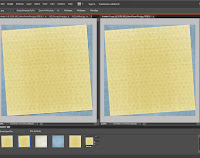
 Here you can see the same digital papers side by side, one with a drop shadow applied and the other without it. The first helps creates the illusion of realism, giving depth to the image. That is the point of working with shadows in our digital scrapbooking.


Lastly here are just a couple extra tips, shortcuts really, one to make adding shadows a bit quicker and the other will help you personalize PSE's interface to your own preferences. These may not be applicable to earlier versions of PSE. I know they weren't possible with PSE 5, and while I am not sure I don't think they were options with PSE 6 or 7 (if you know otherwise, please let me know).


Once you have your drop shadow set just how you want it on one item, you can easily apply the same shadow with the same settings to another by this method. Right click on the layer in the Layers bin that has the shadow on it. A menu will appear (for some reason my computer didn't want to take screen shots of that menu). On that menu select "Copy Layer Style". Then, once you have your next paper or item in your layout, you can then right click on it in the Layers bin and select "Paste Layer Style". The shadow will then be on that layer with the exact same settings as the other layer.
 

To personalize PSE, right click on the "Low" icon in the Drop Shadow menu and choose the "Add to Favorites" option. 


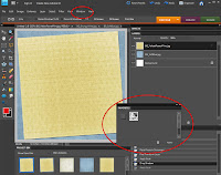
 Now go above the work space to the top menu and click on "Windows" (within the smaller red circle). From that drop menu choose "Favorites" and the Favorites bin will appear floating (within the larger red circle).
Now drag this floating Favorites bin into the docked bins on the right, by clicking and dragging the tab with the word "Favorites" on it and putting it below the Layers bin. A glowing blue line will appear to show you where the bin will be when you let go of the mouse and "drop" it.

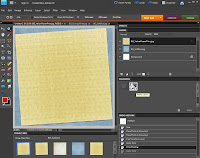
 You can leave the bin there, or move it up or down by clicking and dragging it to where you want it to be. I like to organize my bins by having Undo History and Favorites in the same location, and I can access one or the other of them by clicking on the tabs. I added the Undo History bin from the "Windows" menu the same way that I added the Favorites bin. There are a lot of bin options in the "Windows" menu. Feel free to play with them to find what set up works best for you.

In my Favorites bin you can also see the icon for "Masks Layers". It is for using layer masks in PSE, and I did a tutorial about layer masks previously that you may be interested in. It is more technical than this one, but I have been told that it is understandable even to a PSE newbie.

Wednesday, May 18, 2011

PSE Free Transform

This is a tutorial for Photoshop Elements' free transform tool, with a focus on resizing and rotating items without skewing or distorting the item. The screen shots are from PSE version 8, but the concepts apply to all versions. As always, click on any screen shot to see it full sized.

 Start by putting your photo (or other item you wish to resize) in your working area and selecting the Move tool. It is the little crosshairs and cursor icon first in the Tools bin on the left (within the red circle). However, you can also select the Move tool with the keyboard shortcut V (just hit the letter V).  Make sure the "Show Bounding Box" option is check above (where the red checkmark is) and that the photo is bounded by those little squares on the corners and half way along each side (also shown within the red circle).

 Now get the Free Transform tool going. Free Transform is a function of the Move tool, so that is why I had us start with it. With the Move tool selected, put your cursor on one of the bounding box squares and click. This automatically gets the Free Transform tool open. In addition, you can use the keyboard shortcut of holding the control key and hitting the letter T (ctrl+T) to select the Free Transform tool at any time, whether the Move tool is selected or not.

Notice that the bounding box on the photo changed slightly, now that the Free Transform tool is in action. It went from dotted lines between the squares to solid lines between. Also notice that the menu above the working space has also changed.

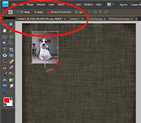
 When you begin to resize your photo, you need to verify that the "Constrain Proportions" box is checked (notice red checkmark). Now click and drag one of the corners of the photo to make it bigger or smaller (note, in the program the cursor will change to look like a small double headed black arrow when you are on the corner). Notice that the percent resized is equal for both width and height, designated W: and H: within the red circle (both are 44.4% here).


 This screen shot shows what happens when you try to click and drag a corner of the photo when "Constrain Proportions" is not checked. The result is what is called a skewed or distorted photo, with the percent changed being unequal for the width and height (74.7% and 56.2% respectively).


 This last screen shot simply shows rotating or tilting a photo using the Free Transform tool. Put the cursor over the little circle that appears below the bottom center of the bounding box. The cursor will change into a little circle made up of little black arrows when there. Then click and drag right or left to rotate or tilt the photo.

The tool item that is underlined in red here shows the degree of rotation. It's nice sometimes to know the exact degree of rotation so that you can match up exact angles on other items, if you need to do so.

When you finish resizing and rotating your photo, simply click on the green checkmark that appears below it whenever the Free Transform tool is selected. Doing this makes your changes. Clicking on the red circle with a line through it undoes your changes.